A summer-long themed entertainment exploration through the lens of a children's museum exhibit that is:
Compliant with the Smithsonian’s Guidelines for Accessibility
Supportive of visitors’ social/emotional growth
Interactive and fun
This personal project allowed me to dive deep into accessibility in public spaces and prioritize playfulness in my design.
Objective
Research
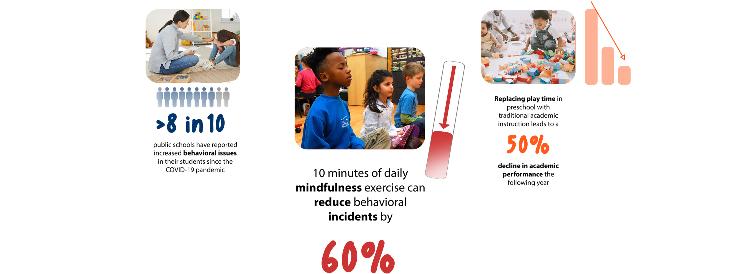
Children have struggled with emotional regulation since the Covid-19 pandemic began. Children’s museum exhibits about topics like breathwork can help reduce behavioral incidents in schools. Successful children’s products and experiences often include bloated shapes and satisfying textures. Implementing bright colors challenges the idea that mindfulness is boring.
Concept
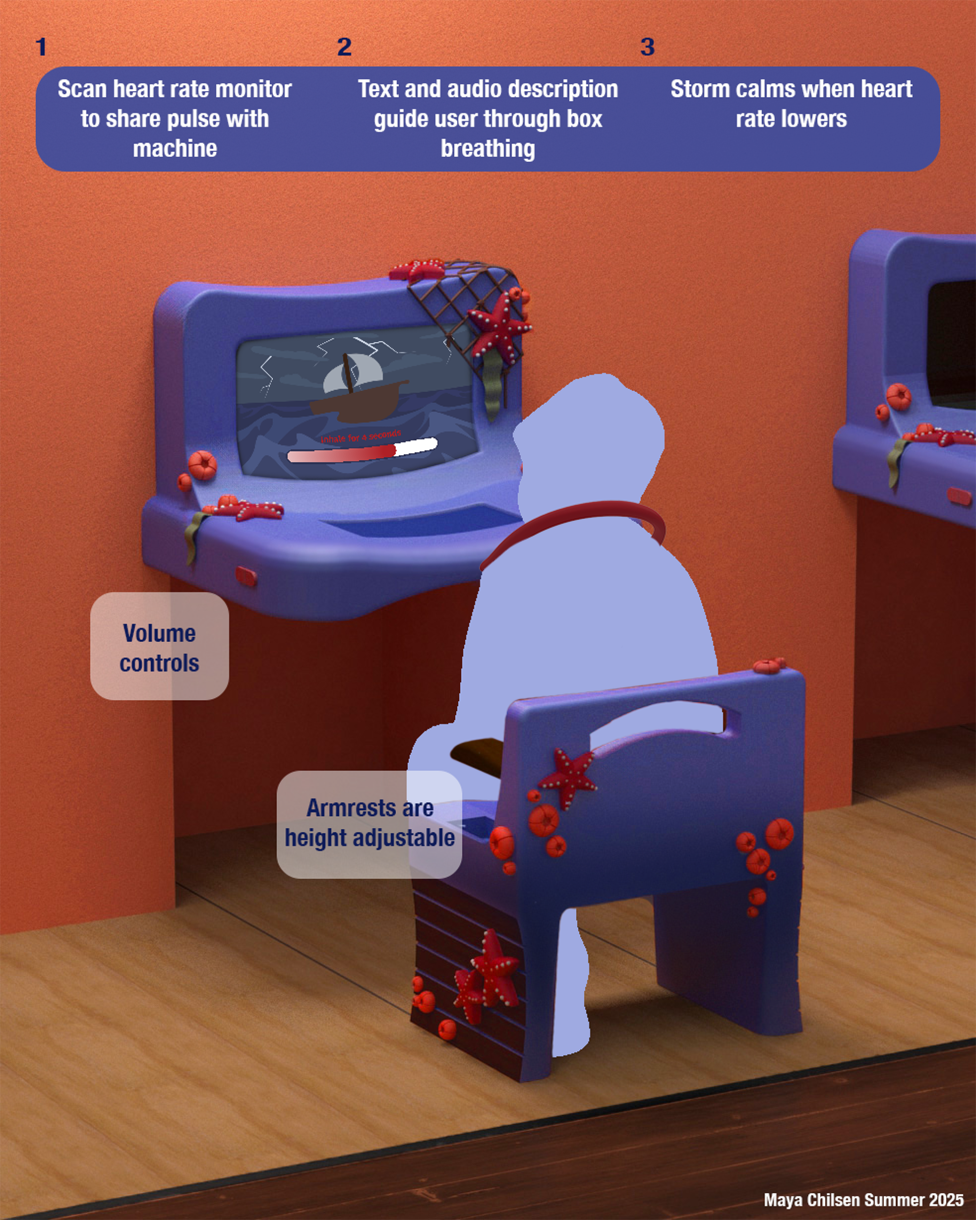
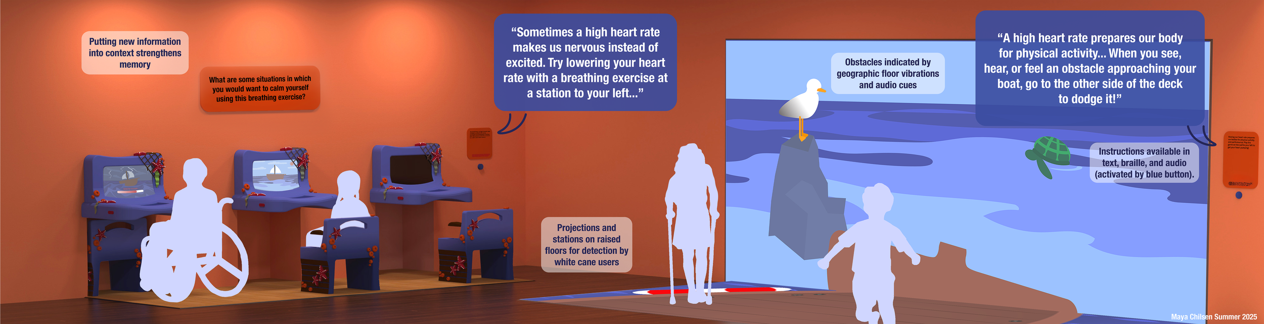
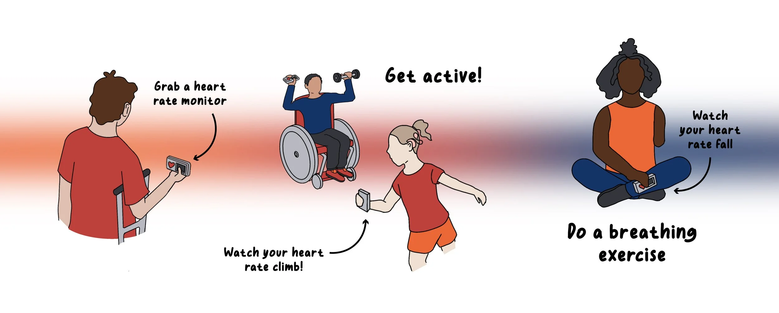
In order to demonstrate the efficacy of breathwork, the exhibit will involve heart rate monitors for each visitor, an activity that increases heart rate, and a station that guides the user through a breathing exercise that lowers it.
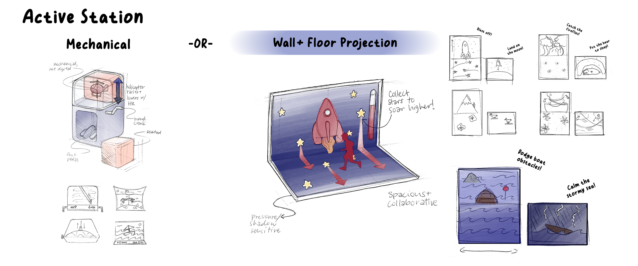
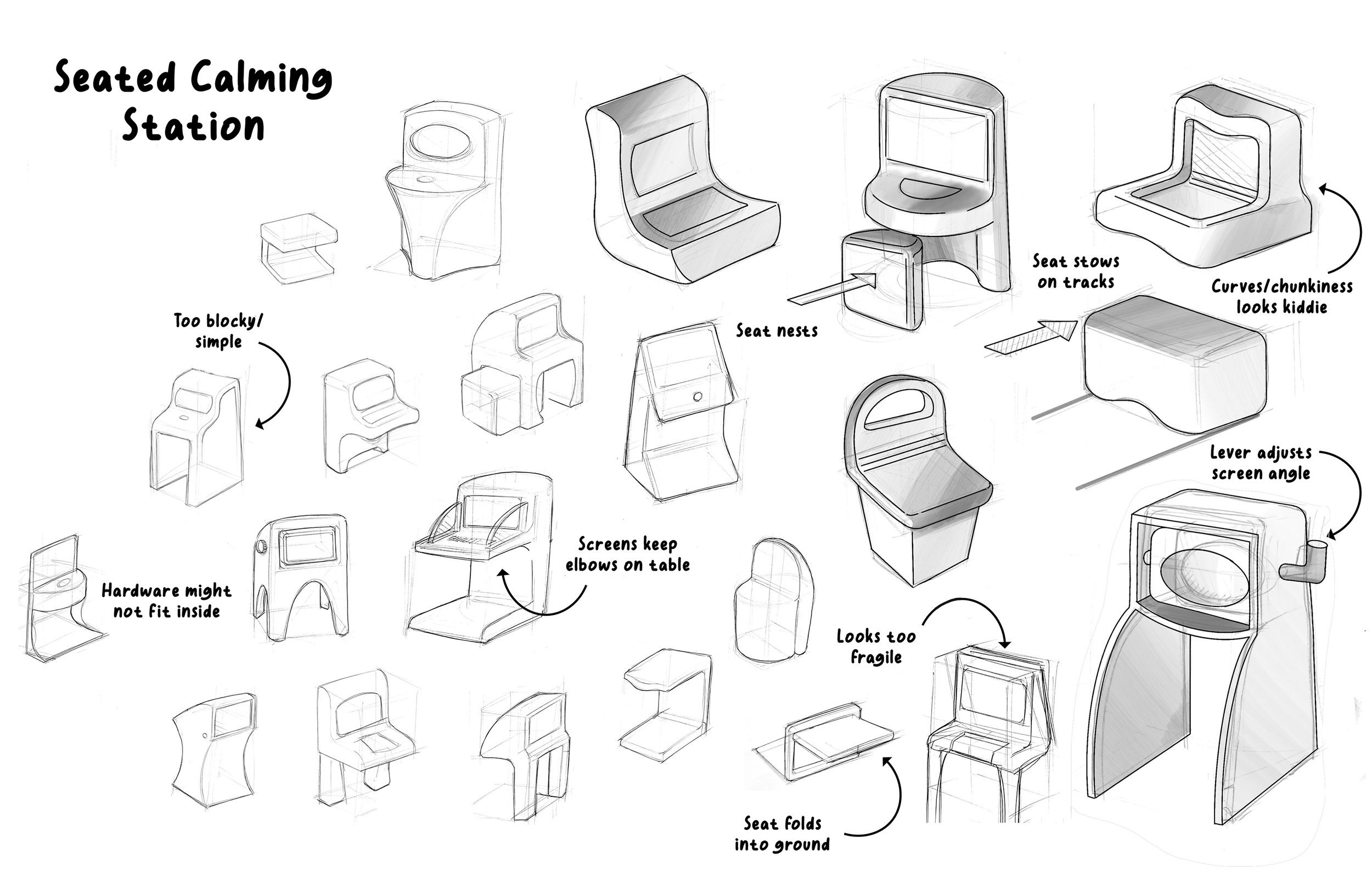
Station
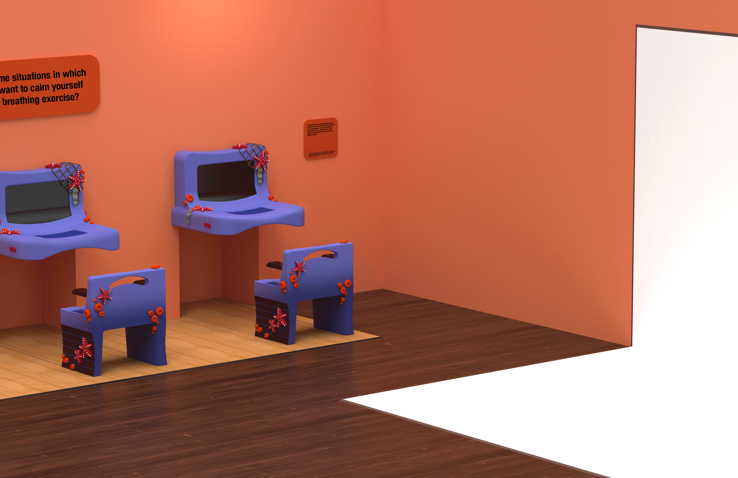
Ideally, museums limit screens, but mechanical active stations may have excluded users with limb differences. A projected game is collaborative and spacious, including users with mobility aids. Strong breathing stations included plenty of curves and had stowing seats for wheelchair users.
Theming
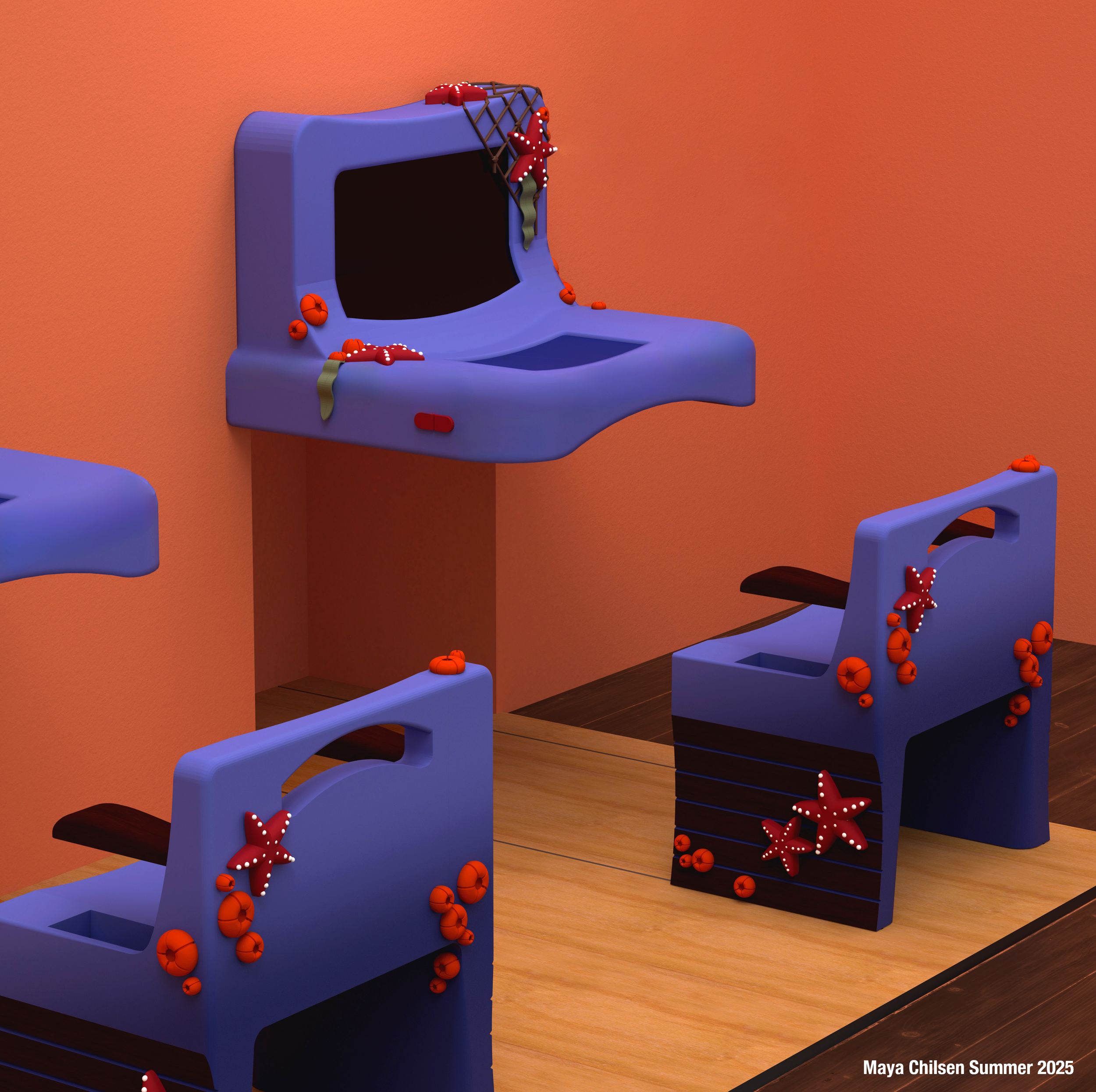
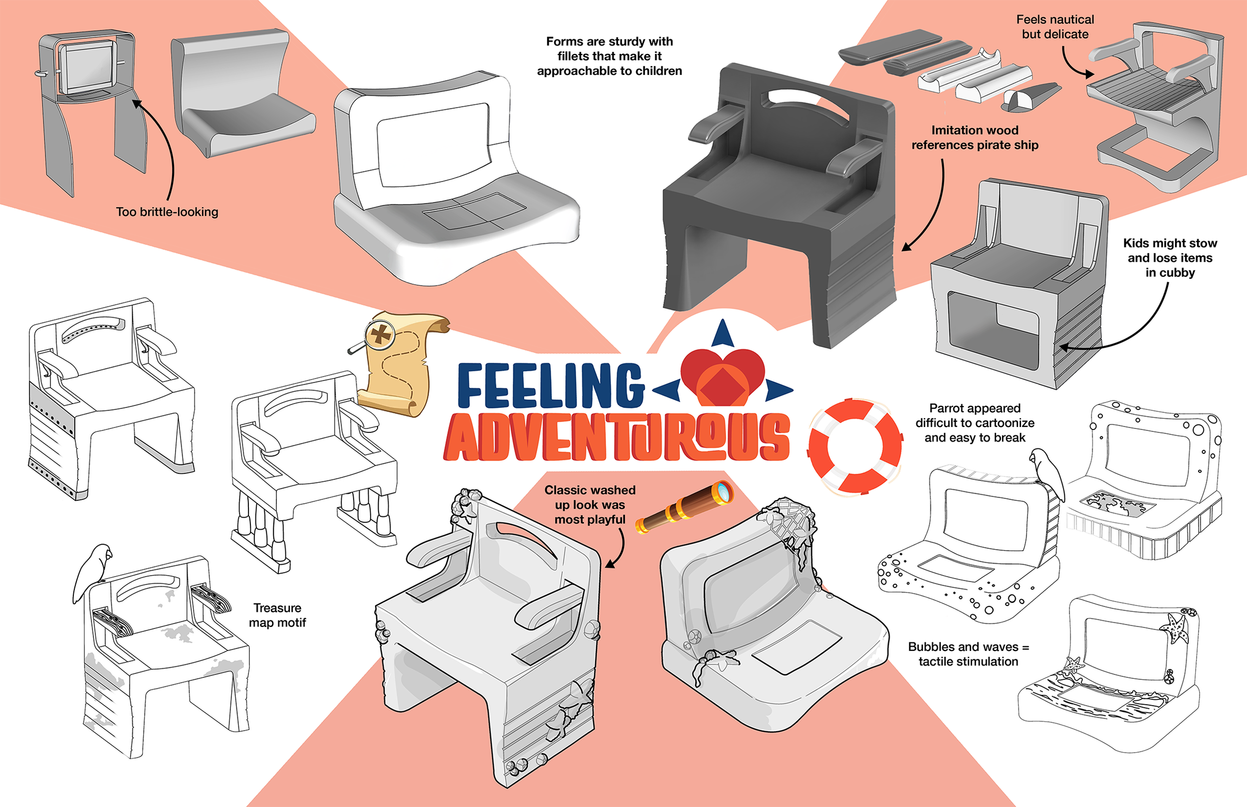
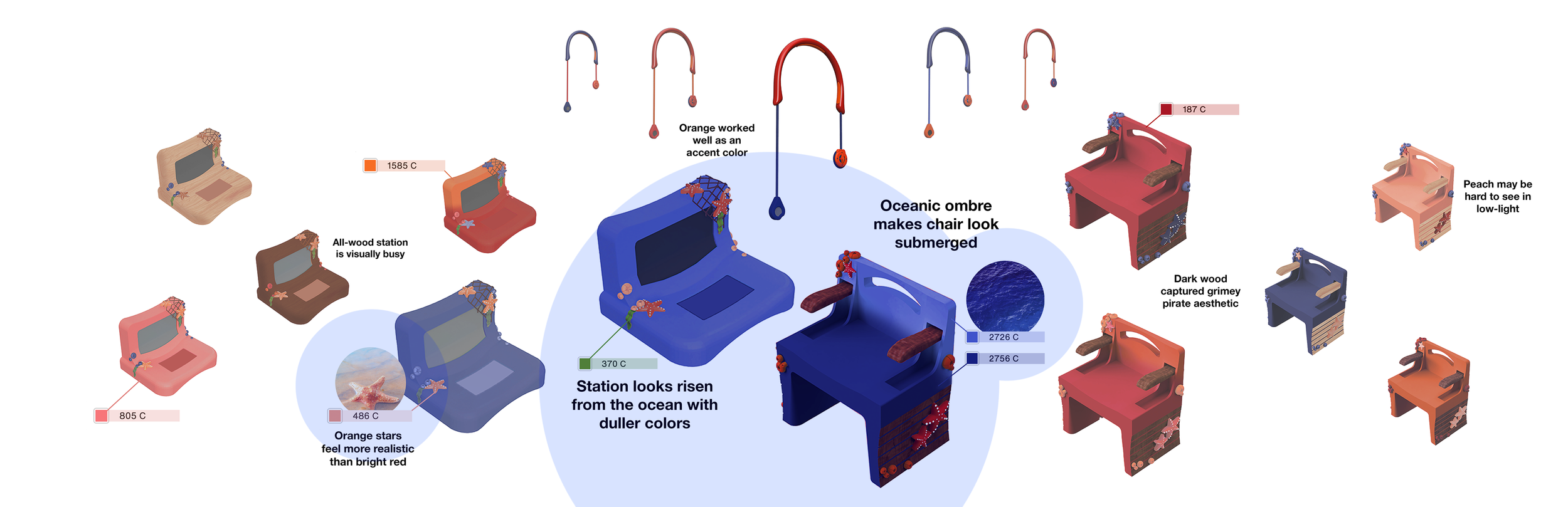
Modeled in SketchUp and Fusion, the set includes a bowed tabletop for visitors who struggle with coordination and muscle weakness as well as stowing armrests that include visitors of all sizes. The sea travel theme developed as a parallel to exploring emotions. Sea stars, barnacles and seaweed were ideal nautical symbols, adding the most tactile interest to the forms.
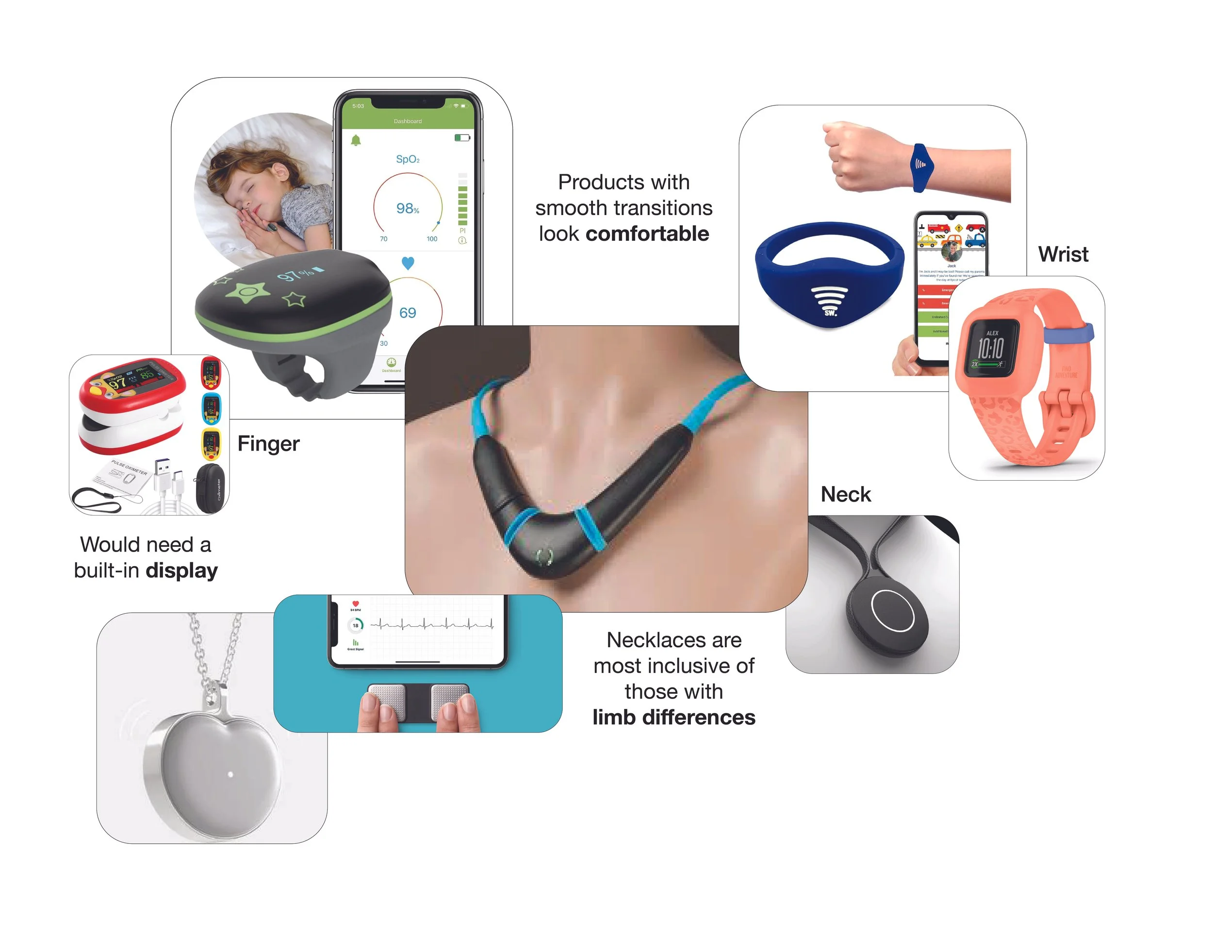
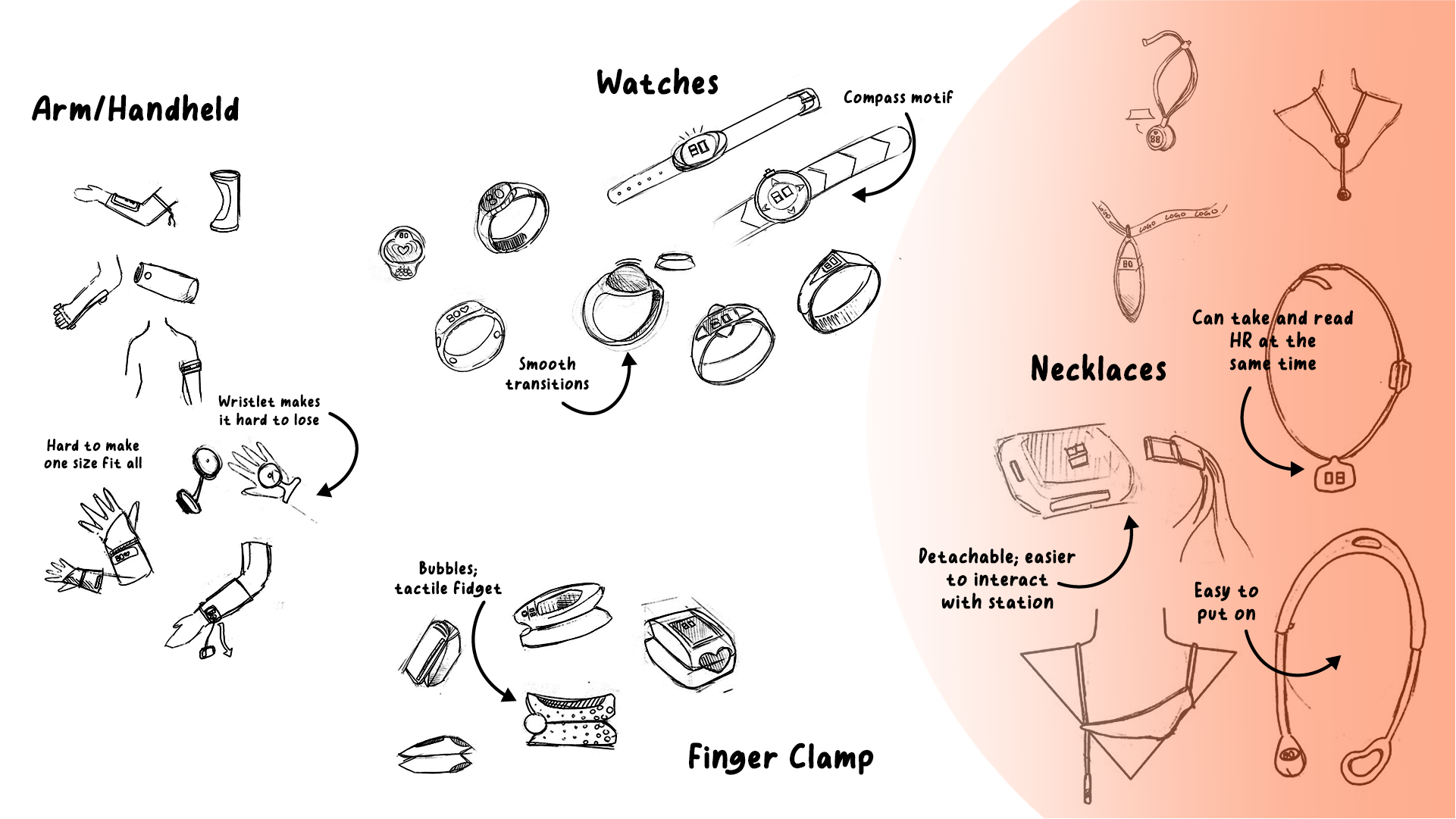
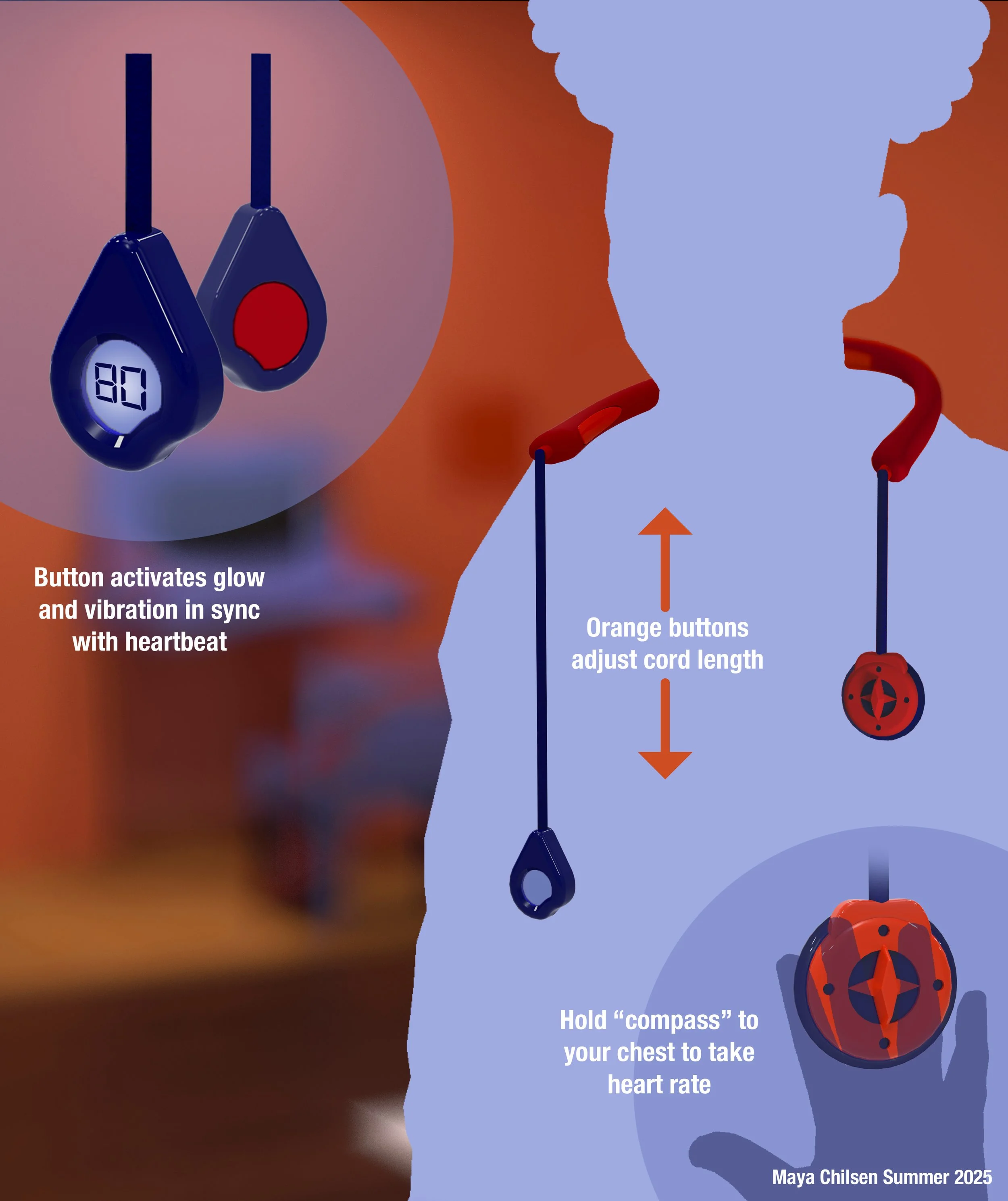
HRM
It’s important that the heart rate monitor be tethered to easily forgetful children. Necklaces are the most inclusive form, considering users with limb differences. From there, the strongest concepts appeared comfortable and playful, instead of sophisticated. The open-bottom concept is easy to put on, and a unique shape that piques a child’s interest.
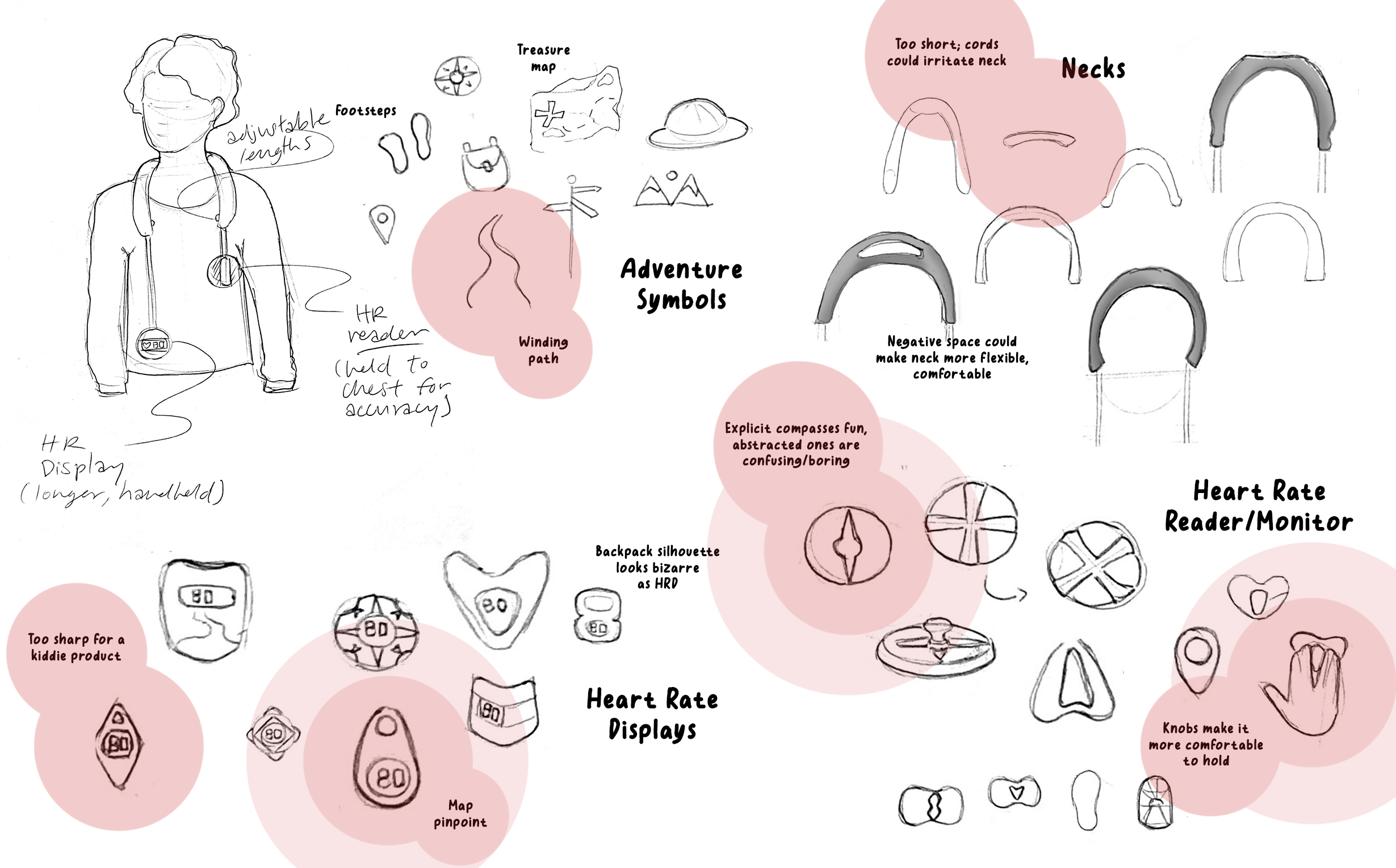
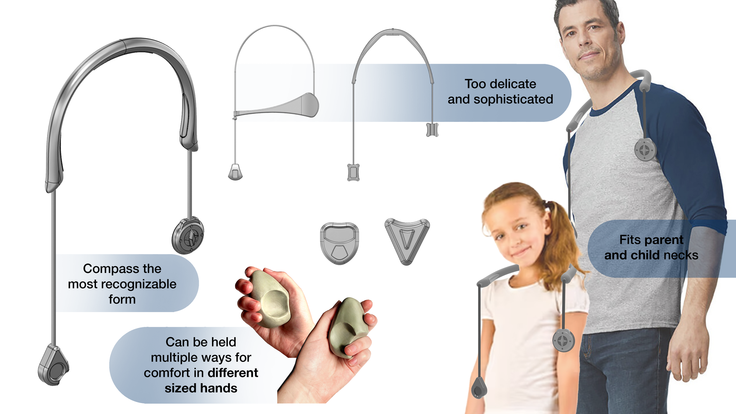
Refinement
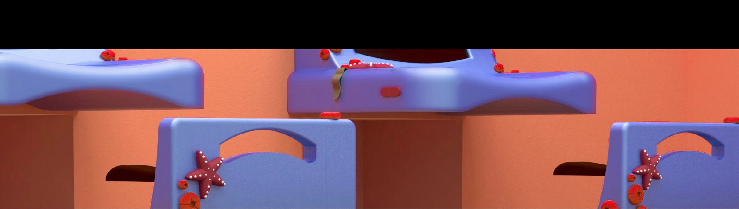
The neck piece has buttons on its sides that adjust the length of the cords attached to the heart rate monitor and display. They are inspired by a compass and a pinpoint on a map, respectively, for more thorough immersion. The pinpoint has a wedge cut out of it so it fits more naturally in the hand.
Color
Selecting contrasting colors is an important part of making a museum exhibit accessible to those with low vision. Since the station and chair ended up with aquatic blue hues, so they appeared to have just emerged from the sea, a lighter and warmer coral was fitting for the walls.
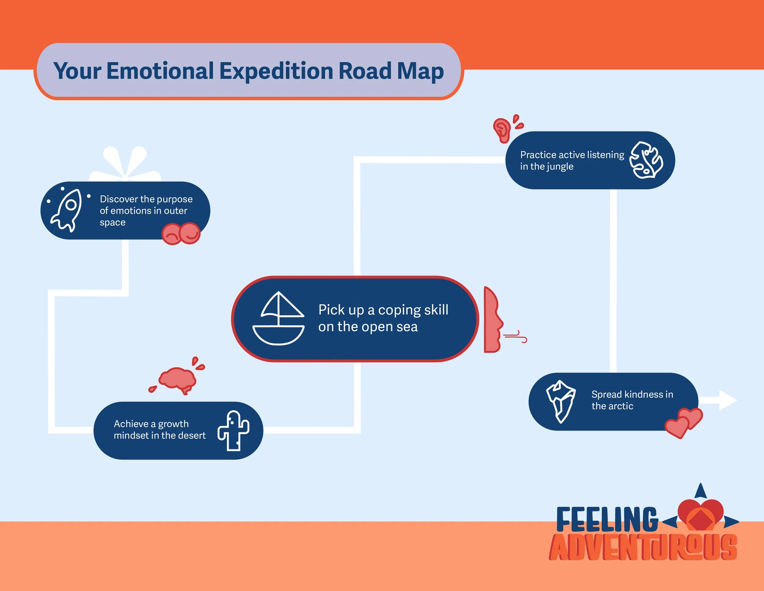
The two stations would only be a small part of a more robust adventure-themed exhibit about SEL. The outline above provides visitors with intellectual disabilities with a clear path forward, and a preview of what’s to come. Some final touches make the experience multi-sensory-- meaning there are various ways to access information. Everything should be visual, audible, AND tactile, so no one is missing anything.