A 15-week power tool intensive through the lens of a spray mop that:
Addresses the limitations of users with arthritis
Conceals and strategically utilizes motorized and electronic internals to improve the cleaning experience
Meshes with Karcher’s existing brand language
This project challenged me to perform and respond to field research and work around complex internals.
Objective
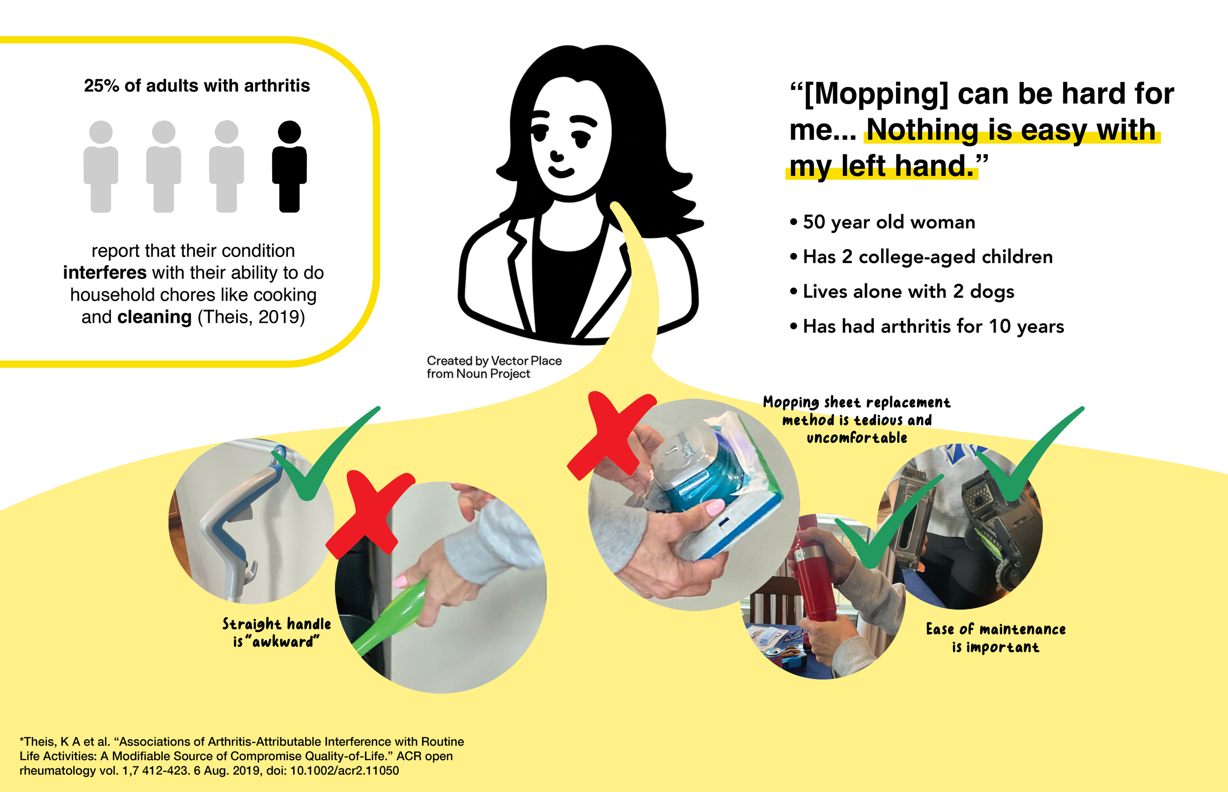
The Problem
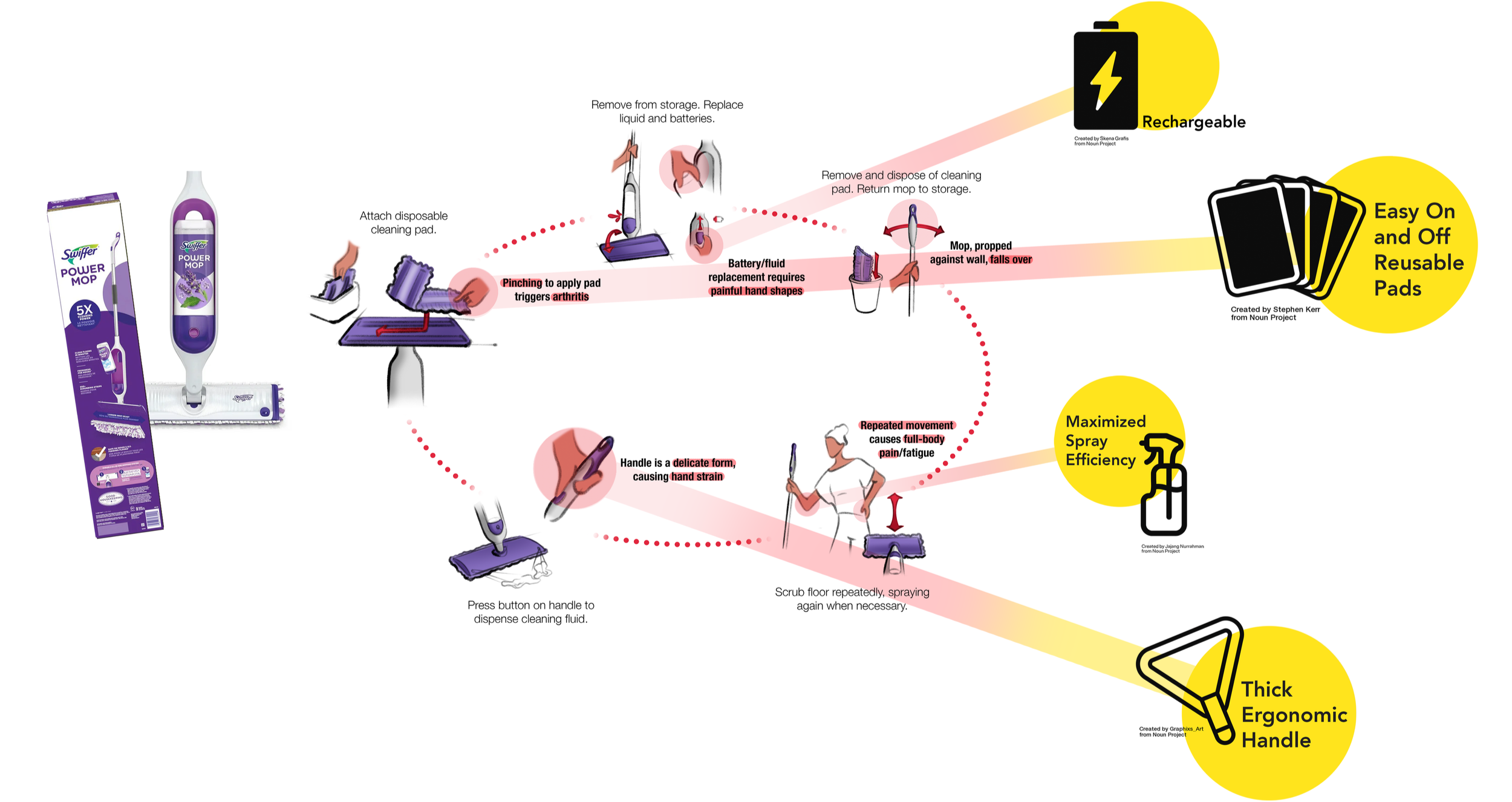
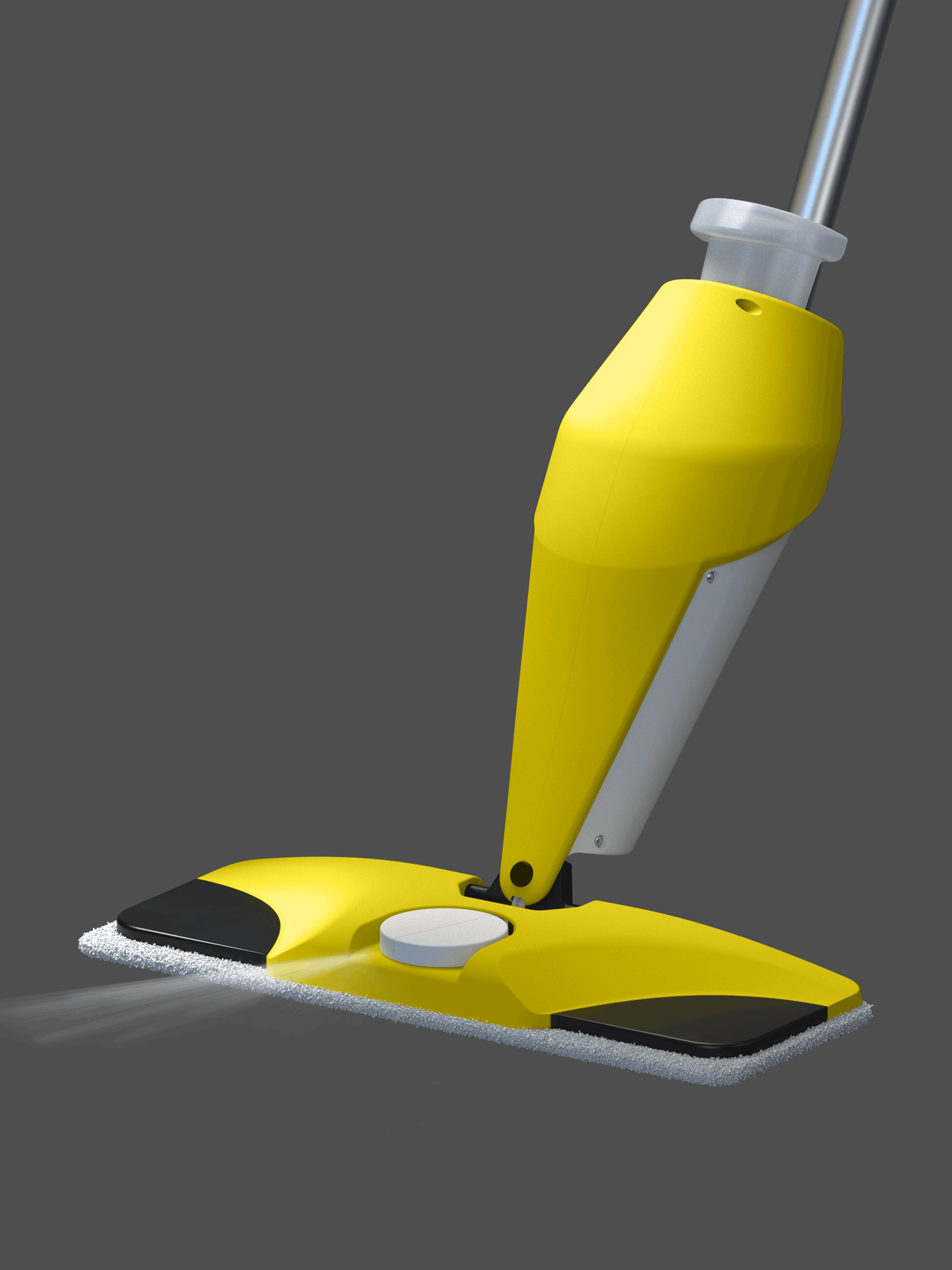
I interviewed and observed a woman with arthritis using her spray mop. The disposable pads required painful hand shapes to replace and the handle was awkwardly-shaped— it was uncomfortable to use for long cleaning sessions.
The Goal
A task analysis revealed the most necessary improvements: easy on-and-off reusable pads, a thick ergonomic handle, long battery life, and maximized spray efficiency enabled by a motor would make cleaning less intimidating and painful for disabled individuals who live independently.
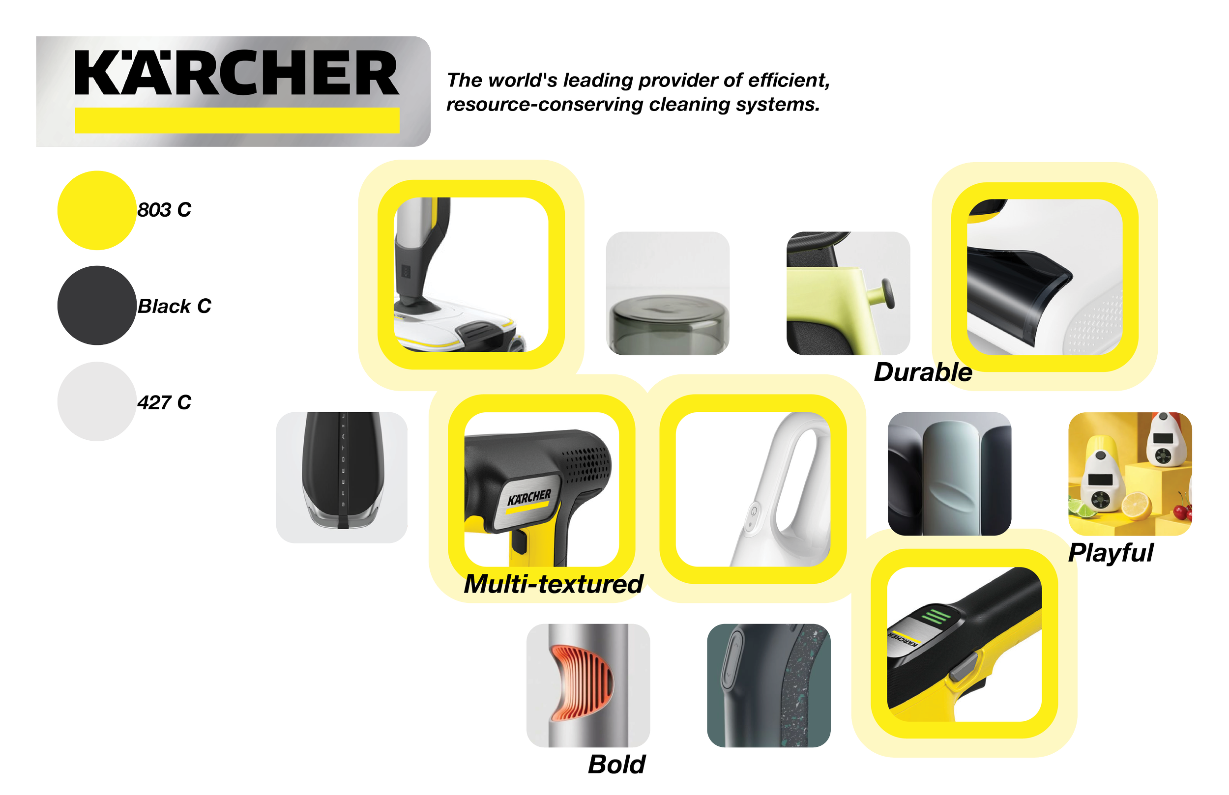
The Brand
Karcher is a sustainable German brand that designs powerful cleaning equipment with a distinct black, white, and yellow color palette. I was inspired by the colors, mixed materials, and bold forms in their portfolio that communicate durability and playfulness.
Ideation
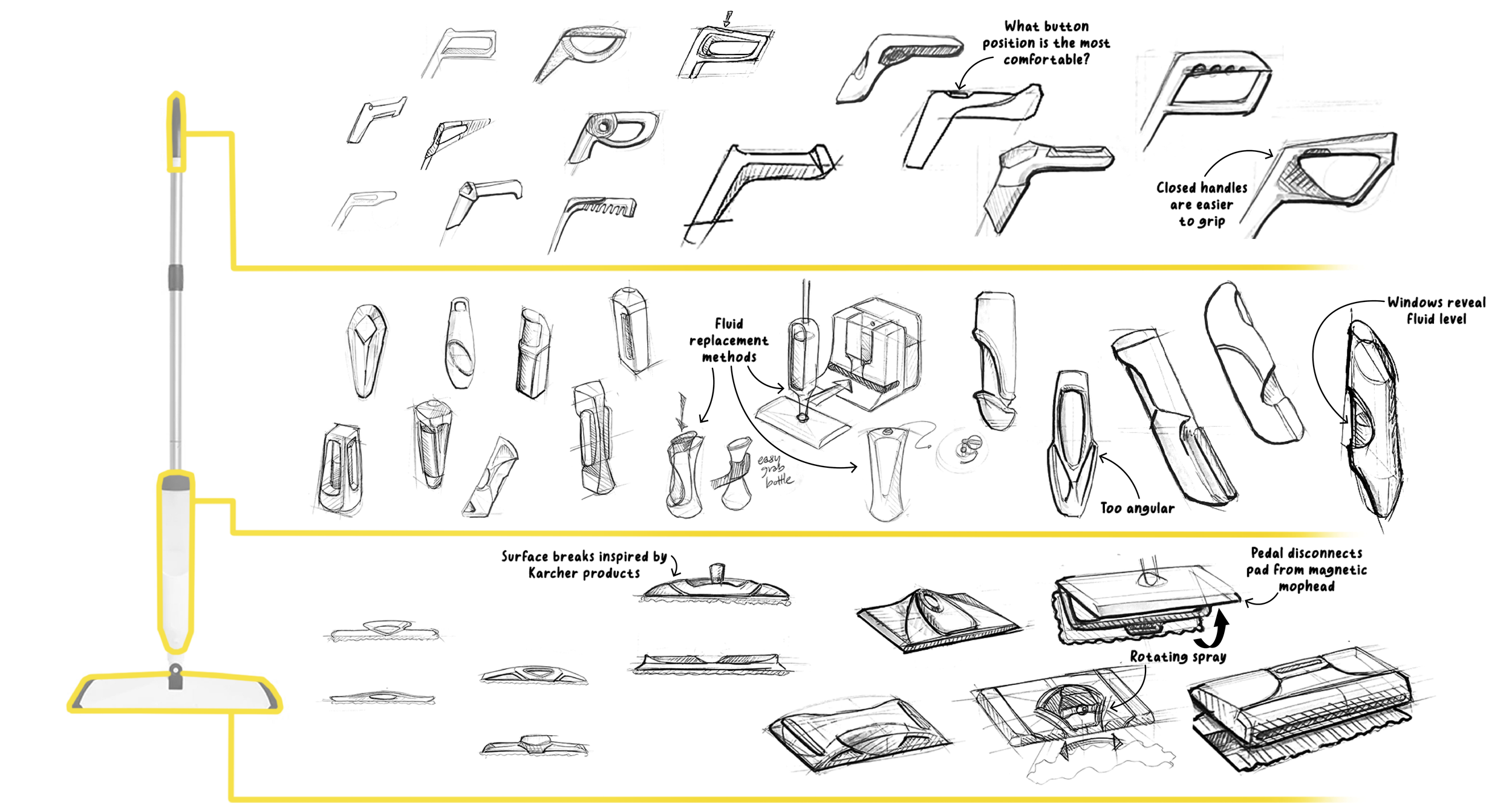
In the first round of sketching, I explored surface breaks to communicate power, organic shapes that added hints of fun, and how functional features like fluid level windows and pad releasing pedals could add visual interest and efficiency. I moved forward seeking balance with a combination of trapezoids and rounds.
Refinement
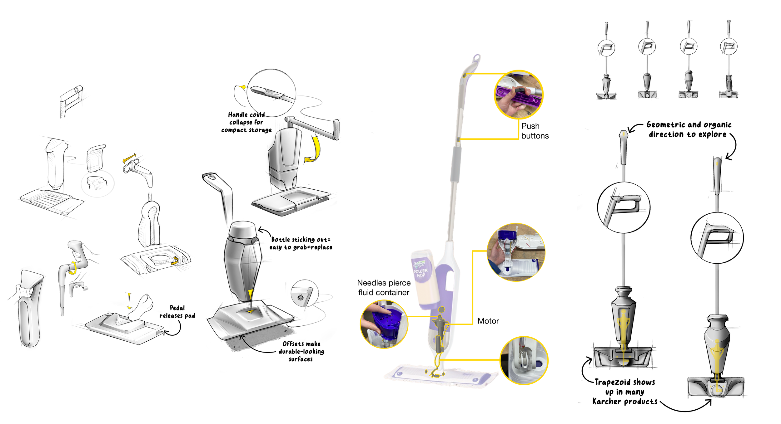
In the second round of sketching, I paid special attention to internal integration and functional features. A circular rotating spraying component opened the door for a matching revolved body and removable fluid container, that balanced out the sharper geometric forms for a synthesis of strength and approachability.

3D Exploration
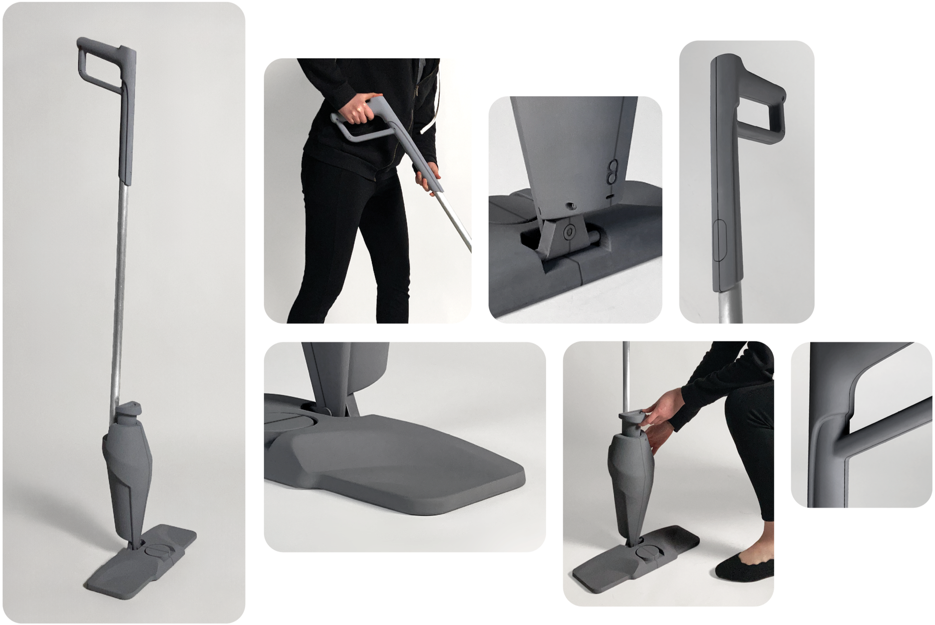
My low fidelity explorations revealed strong potential in closed cylindrical handles with varying thickness, as well as a trapezoid motif and an organic silhouette for the body.
Narrowing Down
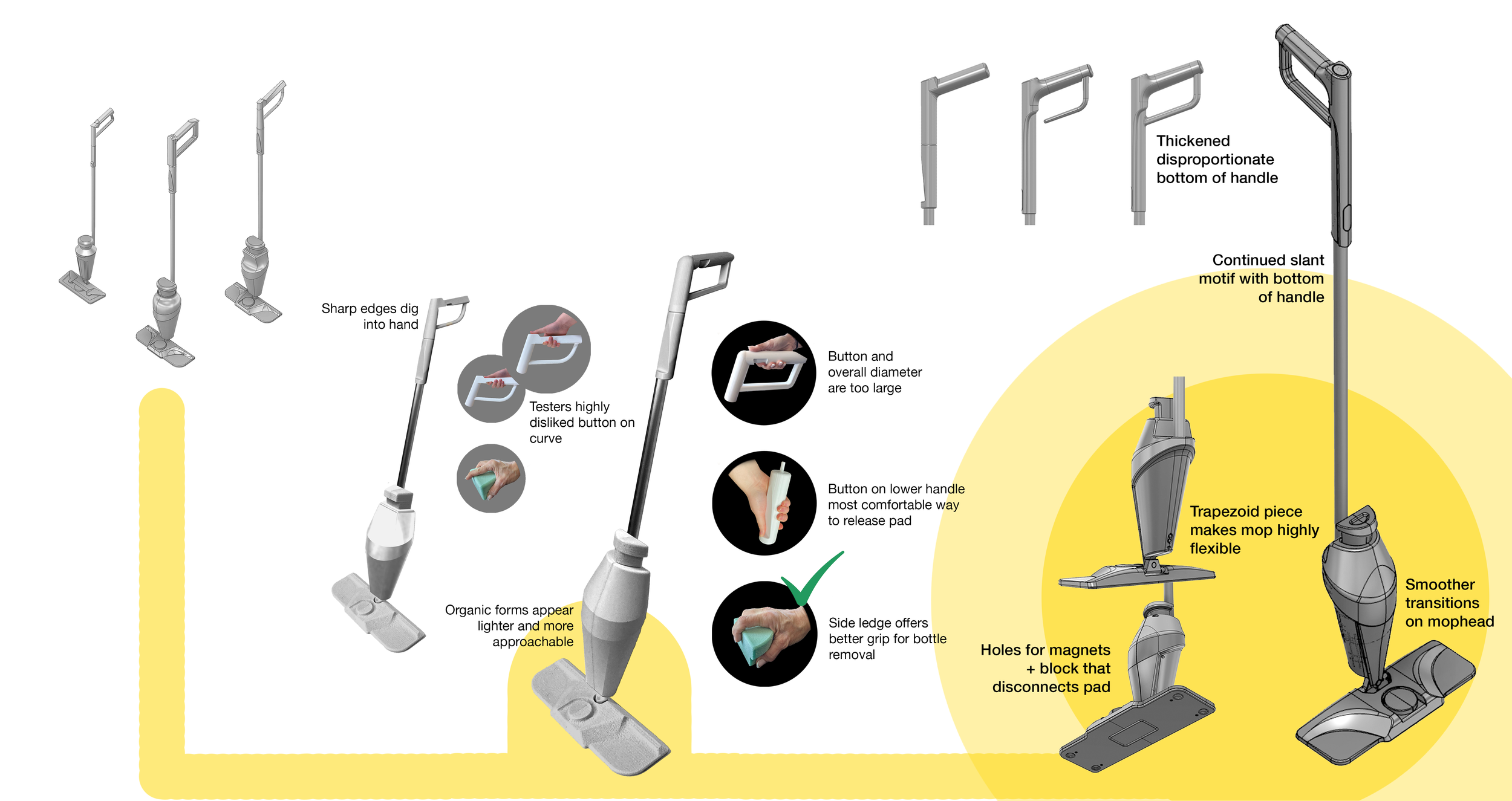
Later 3D development added lots of offsets and directional tapers to the form— extreme versions of the trapezoid, but with rounded corners that softened the former industrial look. I got additional feedback from the woman with arthritis, who recommended rounded touchpoints, like the top of the fluid container, and a scaled-down handle.
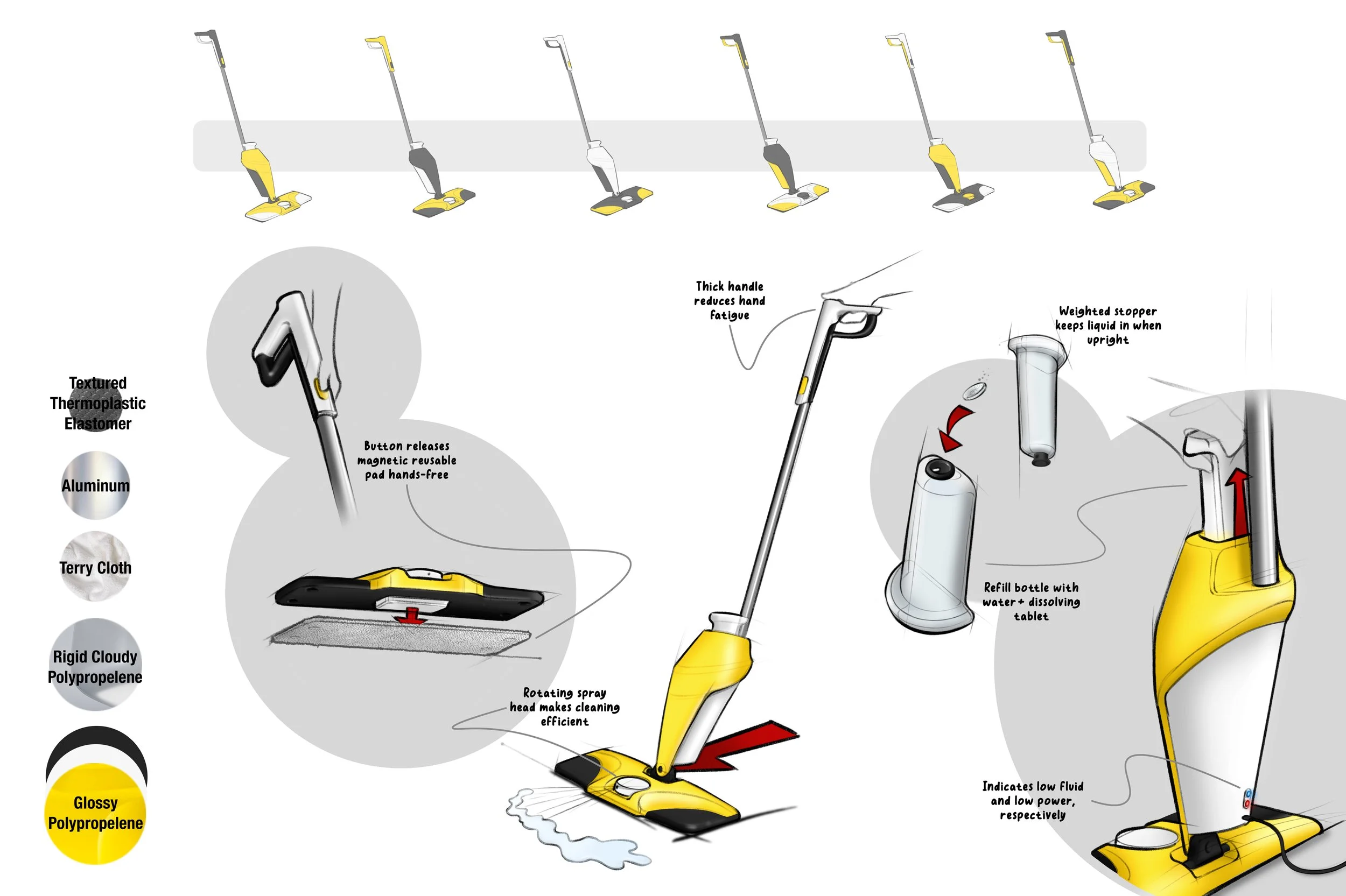
It took many attempts to create a balanced composition of white, yellow, and black— the latter two could easily overpower. I landed on yellow for the largest pieces as well as touchpoints, so the mop is eye-catching and fun. Black provided contrast and grounding. And white allowed a place for the eye to rest and made it easy to spot buttons and indicators.
Features
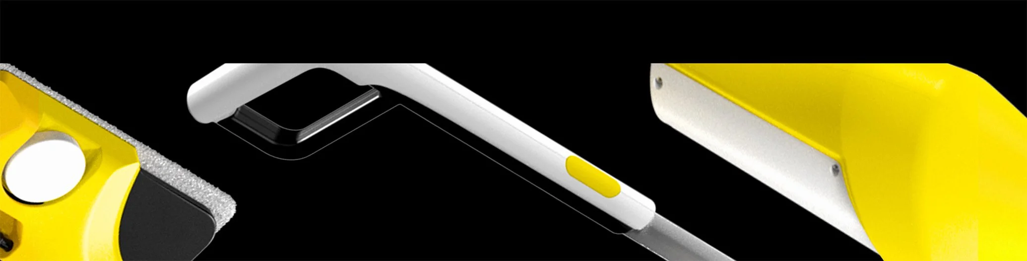
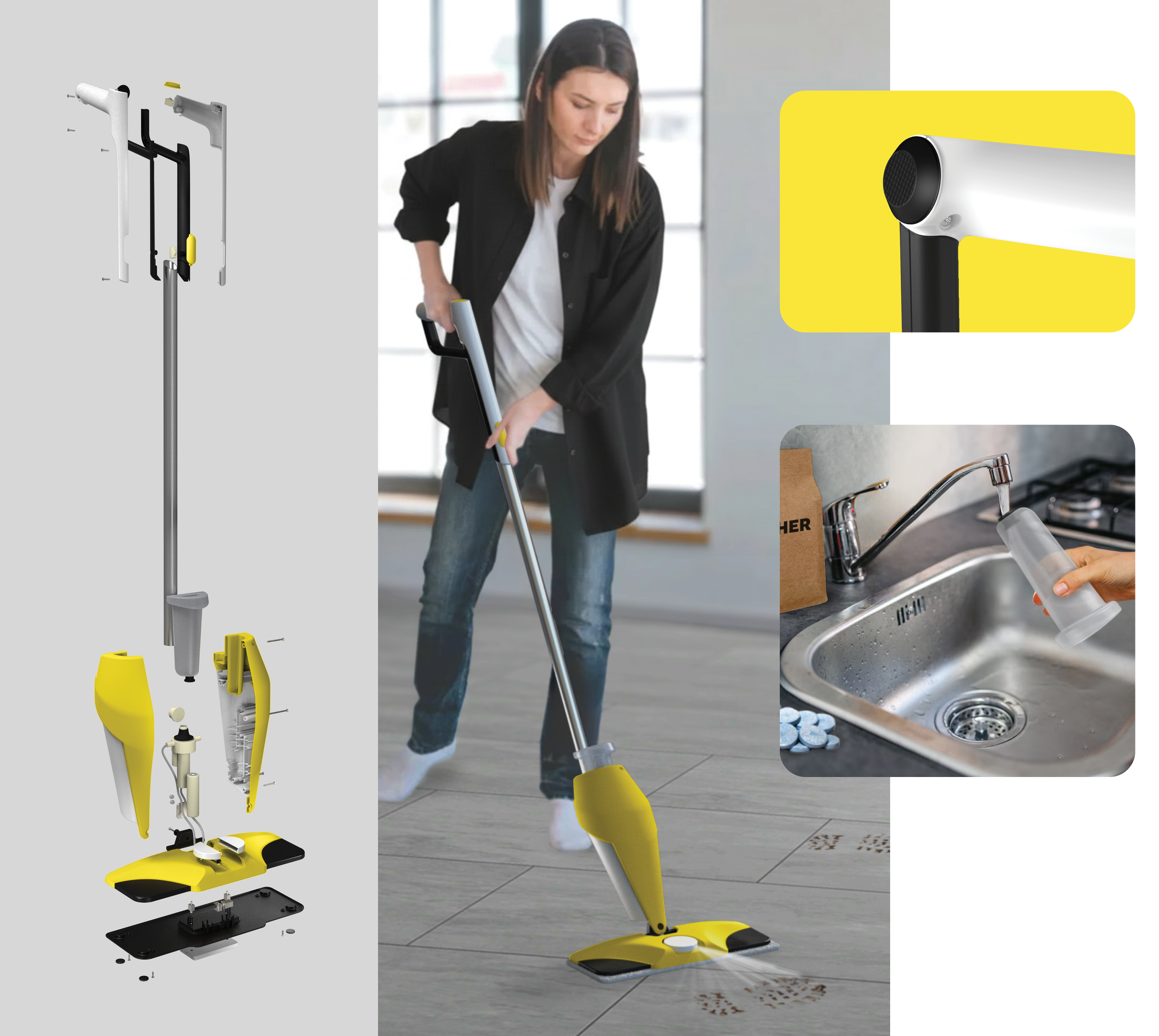
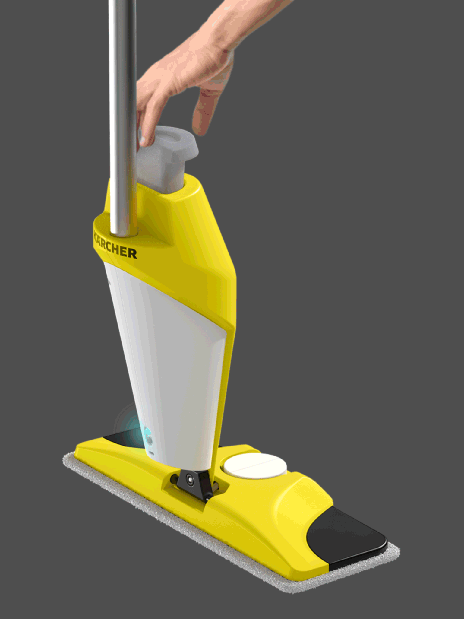
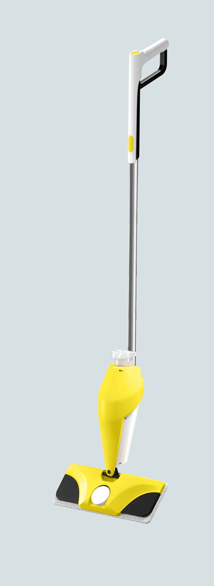
The final product features a rotating spraying component which cuts down on physically-taxing maneuvering, magnets that easily pick up the reusable pad and release it at the touch of a button (without the user bending down), an easily-grippable fluid container that enables the use of eco-friendly dissolvable cleaning tablets to reduce plastic waste, and lights that alert you when the mop is low on fluid or power.